Centralized stylesheet constants for dark-themed dialogs. More...
#include <DialogStyles.hpp>
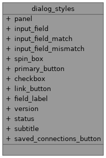
Collaboration diagram for dialog_styles:
Static Public Attributes | |
| static const QString | panel |
| static const QString | input_field |
| static const QString | input_field_match |
| static const QString | input_field_mismatch |
| static const QString | spin_box |
| static const QString | primary_button |
| static const QString | checkbox |
| static const QString | link_button |
| static const QString | field_label |
| static const QString | version |
| static const QString | status |
| static const QString | subtitle |
| static const QString | saved_connections_button |
Detailed Description
Centralized stylesheet constants for dark-themed dialogs.
These styles are shared between LoginDialog and SignUpDialog to ensure visual consistency. Change them here to update the appearance globally.
Member Data Documentation
◆ panel
|
static |
Initial value:
= R"(
QWidget#mainPanel {
background-color: #1A1A1A;
}
)"
◆ input_field
|
static |
Initial value:
= R"(
QLineEdit {
background-color: #2d2d2d;
border: 1px solid #3d3d3d;
border-radius: 4px;
padding: 8px 12px;
font-size: 13px;
color: #ffffff;
}
QLineEdit:focus {
border-color: #5a5a5a;
background-color: #333333;
}
QLineEdit::placeholder {
color: #707070;
}
)"
◆ input_field_match
|
static |
Initial value:
= R"(
QLineEdit {
background-color: #2d2d2d;
border: 2px solid #4CAF50;
border-radius: 4px;
padding: 8px 12px;
font-size: 13px;
color: #ffffff;
}
QLineEdit:focus {
border-color: #4CAF50;
background-color: #333333;
}
)"
◆ input_field_mismatch
|
static |
Initial value:
= R"(
QLineEdit {
background-color: #2d2d2d;
border: 2px solid #FF9800;
border-radius: 4px;
padding: 8px 12px;
font-size: 13px;
color: #ffffff;
}
QLineEdit:focus {
border-color: #FF9800;
background-color: #333333;
}
)"
◆ spin_box
|
static |
Initial value:
= R"(
QSpinBox {
background-color: #2d2d2d;
border: 1px solid #3d3d3d;
border-radius: 4px;
padding: 8px 12px;
font-size: 13px;
color: #ffffff;
}
QSpinBox:focus {
border-color: #5a5a5a;
background-color: #333333;
}
)"
◆ primary_button
|
static |
Initial value:
= R"(
QPushButton {
background-color: #3d3d3d;
color: #ffffff;
border: none;
border-radius: 4px;
padding: 10px 24px;
font-size: 14px;
font-weight: bold;
}
QPushButton:hover {
background-color: #4a4a4a;
}
QPushButton:pressed {
background-color: #333333;
}
QPushButton:disabled {
background-color: #2a2a2a;
color: #555555;
}
)"
◆ checkbox
|
static |
Initial value:
= R"(
QCheckBox {
background: transparent;
color: #909090;
font-size: 12px;
spacing: 6px;
}
QCheckBox::indicator {
width: 14px;
height: 14px;
border: 1px solid #3d3d3d;
border-radius: 2px;
background-color: #2d2d2d;
}
QCheckBox::indicator:checked {
background-color: #4a4a4a;
border-color: #5a5a5a;
}
)"
◆ link_button
|
static |
Initial value:
= R"(
QPushButton {
background: transparent;
border: none;
color: #909090;
font-size: 12px;
padding: 0;
}
QPushButton:hover {
color: #ffffff;
text-decoration: underline;
}
)"
◆ field_label
|
static |
Initial value:
= R"(
QLabel {
background: transparent;
color: #909090;
font-size: 10px;
font-weight: bold;
letter-spacing: 1px;
}
)"
◆ version
|
static |
Initial value:
= R"(
QLabel {
background: transparent;
color: #505050;
font-size: 9px;
}
)"
◆ status
|
static |
Initial value:
= R"(
QLabel {
background: transparent;
color: #707070;
font-size: 11px;
font-style: italic;
}
)"
◆ subtitle
|
static |
Initial value:
= R"(
QLabel {
background: transparent;
color: #707070;
font-size: 12px;
}
)"
◆ saved_connections_button
|
static |
Initial value:
= R"(
QToolButton {
background: transparent;
border: none;
padding: 2px;
}
QToolButton:hover {
background-color: #2d2d2d;
border-radius: 2px;
}
QToolButton::menu-indicator {
image: none;
}
)"